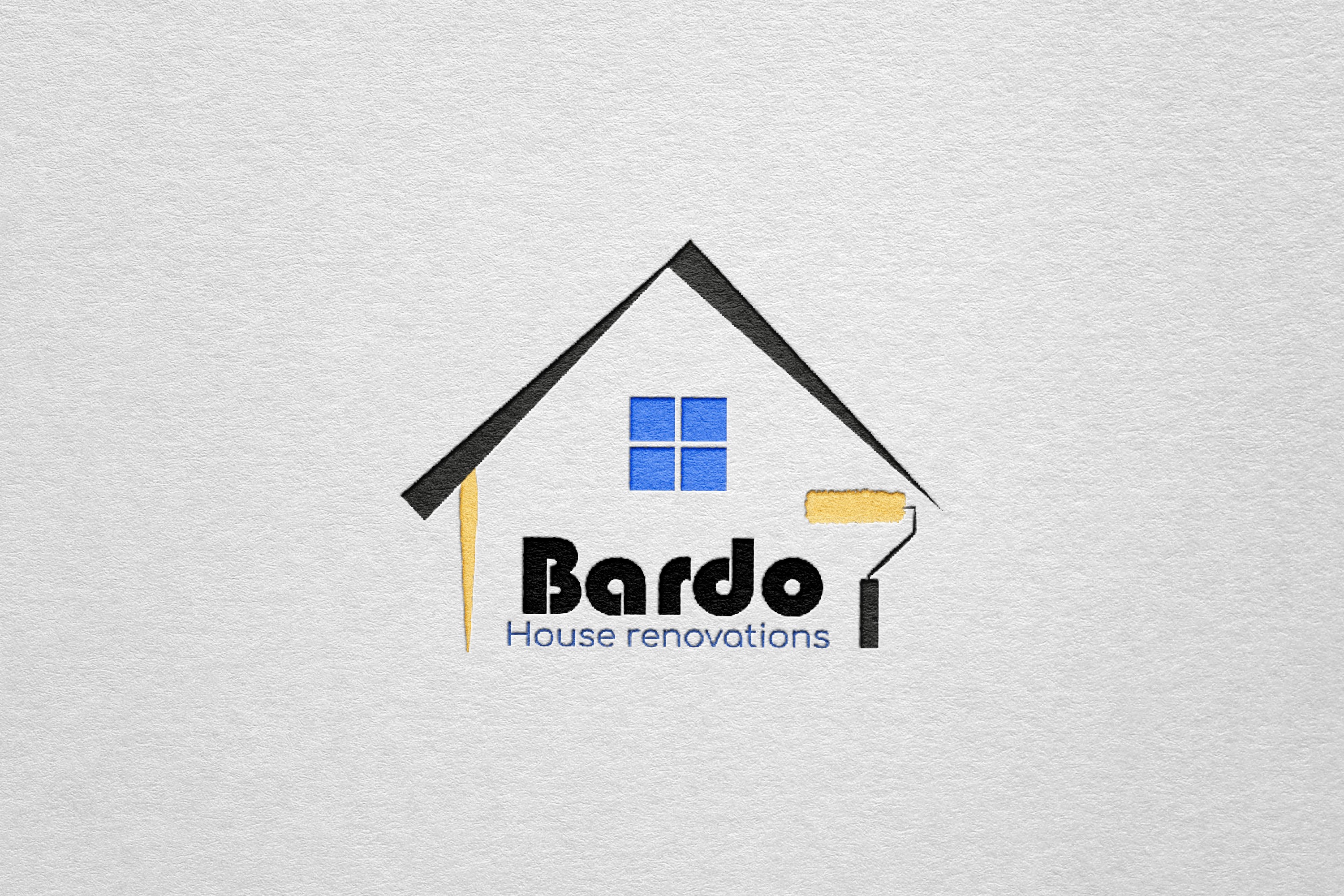
Bardo is a house renovating company. My role was to design a logo and a business card.
When designing the logo for Bardo House Renovations, I wanted to convey the essence of home transformation in a clean, memorable way. Here’s how each design decision supports the brand’s identity and purpose:
Symbolic Shape and Structure
The logo’s main shape resembles a house with a pitched roof, instantly signaling the business's focus on home renovation. The house outline is simple but effective, creating a strong, recognizable symbol that gives viewers an immediate sense of what Bardo offers. By keeping the roof lines sharp and clean, I aimed to communicate precision and professionalism, qualities essential in the renovation industry.
Use of Color
For the color palette, I chose a combination of black, blue, and yellow. The black conveys strength, reliability, and expertise, grounding the logo with a strong foundation. The blue, used in the window graphic, brings a calming and trustworthy element, suggesting that Bardo is a brand homeowners can rely on to make their spaces both functional and beautiful. The yellow paint stroke on the roller and alongside the house outline adds a touch of warmth and creativity, subtly emphasizing the transformative power of a fresh coat of paint—a common aspect of renovation.
Integration of a Paint Roller
The paint roller is an essential element in this design, incorporated to represent the hands-on nature of renovation work. It also hints at the company's skill in fine detailing, whether through painting or other finishing touches. I designed the roller with a yellow paint streak that doubles as part of the house’s structure, symbolizing Bardo’s role in bringing color and life into people’s homes. The way the paint roller extends to the side adds dynamism to the logo, suggesting that Bardo is always in action, continually creating and improving.
Typography Choices
For the text, I selected a modern, bold font for “Bardo” to emphasize strength and confidence, making the company name memorable and visually impactful. The font is rounded yet solid, adding a friendly feel while maintaining a sense of reliability. Beneath it, “House renovations” is in a lighter, clean sans-serif typeface in blue, balancing the logo with a softer, professional touch. This part of the text provides context without overshadowing the brand name, ensuring clarity in what Bardo offers.
Composition and Balance
I carefully balanced the elements so that the roof, window, roller, and text come together harmoniously. The window in the center of the “house” represents openness and transparency, values that are key to Bardo’s business approach. The small gap between the roofline and the walls adds a modern, minimalistic touch, keeping the logo visually open and inviting.
Overall Impact
The final design is clean, versatile, and distinct, encapsulating the essence of a home renovation company that combines reliability with creative transformation. My goal was for this logo to feel approachable and trustworthy, making Bardo a brand that customers can envision as a partner in improving their homes. The simplicity of the design allows it to work well across different mediums, from business cards to vehicle signage, ensuring that Bardo’s brand is consistently recognizable and professional wherever it appears.


